Percentile Capping Method to Detect, Impute or Remove Outliers from a Data Set in R
Sometimes a data set will have one or more observations with unusually large or unusually small values. These extreme values are called Outliers.
For a given continuous variable(the numerical variable of type int or double), outliers are those observations that lie outside 1.5 * IQR, where IQR is ‘Inter Quartile Range’, which is the difference between 75th and 25th quartiles.
-----------------------------------------------------------------------------------------
Q1=First Quartile, or 25th percentile.
Q2 value is lies at index i=(50/100)*n
 -----------------------------------------------------------------------------------------
Phase - II :: Now we will discuss about analyzing and detecting the Outliers in a Dataset.
 >summary(mydata)

if(length(which(q[2]+h<v))==0)
With the par( ) function, you can include the option mfrow=c(nrows, ncols) to create a matrix of nrows x ncols plots that are filled in by row, and mfcol=c(nrows, ncols) fills in the matrix by columns.
>boxplot(airquality$Solar.R, col = "yellow", main = "Boxplot of Solar.R", outcol="red", outpch=19, boxwex=0.75,range = 1.5)
>hist(airquality$Solar.R, col ="yellow", main ="Histogram of Solar.R", xlab = "Observations", breaks = 15)

>boxplot(airquality$Wind, col = "yellow", main = "Boxplot of Wind", outcol="red", outpch=19,boxwex=0.75,range = 1.5)

>boxplot(airquality$Temp, col = "yellow", main = "Boxplot of Temp", outcol="red", outpch=19, boxwex=0.75,range = 1.5)
 > outdetect(airquality$Temp)
There are 0 observations below the Lower Quartile(Q1) Fence(Whisker)
There are 0 observations above the Upper Quartile(Q3) Fence(Whisker)
The Percentile Capping is a method of Imputing the Outlier values by replacing those observations outside the lower limit with the value of 5th percentile and those that lie above the upper limit, with the value of 95th percentile of the same dataset.
>lf<- unname(qnt[1] - h)
>uf<- unname(qnt[2] + h)
>vtemp<-NULL
>qnt <- quantile(mydata$Solar.R, probs=c(.25, .75), na.rm =T)
>h <- (1.5) * IQR(mydata$Solar.R, na.rm = T)
>lf<- unname(qnt[1] - h)
>uf<- unname(qnt[2] + h)
>vtemp<-NULL
#Subsetting Outliers from the Wind Variable
>qnt <- quantile(mydata$Wind, probs=c(.25, .75), na.rm =T)
>h <- (1.5) * IQR(mydata$Wind, na.rm = T)
>lf<- unname(qnt[1] - h)
>uf<- unname(qnt[2] + h)
>vtemp<-NULL
#Subsetting Outliers from the Temp Variable
>qnt <- quantile(mydata$Temp, probs=c(.25, .75), na.rm =T)
>h <- (1.5) * IQR(mydata$Temp, na.rm = T)
>lf<- unname(qnt[1] - h)
>uf<- unname(qnt[2] + h)
vtemp<-NULL
>ol_temp<- subset(mydata, Temp<lf | Temp>uf)


In the Same way we set NA's for the Outliers of each Variable of the Dataset using the above function "rm_outliers()"
Impute Outliers using Percentile Capping Method :
The Percentile Capping is a method of Imputing the Outlier values by replacing those observations outside the lower limit with the value of 5th percentile; and those that lie above the upper limit, with the value of 95th percentile of the same dataset.
>mydata<-airquality
>Impute_OutCap <- function(v,na.rm=T)
{
qnt <- quantile(v, probs=c(.25, .75), na.rm = T)
caps <- quantile(v, probs=c(.05, .95), na.rm = T)
h <- (1.5) * IQR(v, na.rm = T)
sum(v > (qnt[2] + h))
v[v < (qnt[1] - h)] <- caps[1]
v[v > (qnt[2] + h)] <- caps[2]
v<<-v
>mydata$Ozone<-v
>Impute_OutCap(mydata$Wind)
>mydata$Wind<-v

Sometimes a data set will have one or more observations with unusually large or unusually small values. These extreme values are called Outliers.
For a given continuous variable(the numerical variable of type int or double), outliers are those observations that lie outside 1.5 * IQR, where IQR is ‘Inter Quartile Range’, which is the difference between 75th and 25th quartiles.
-----------------------------------------------------------------------------------------
Phase - I :: First we will discuss about the Percentiles, Quartiles and Inter Quartile Range in in Statistics
Percentile :
The Percentile provides the information about how the data are spread over the interval from the smallest value to the largest value.
For the data that do not contain numerous repeated values, the pth percentile divides the data into two parts.
The pth percentile (Eg: 50th percentile) is a value such that at least p percent (eg: 50%) of observations are less than or equal to this value and at least (100-p) observations are greater than or equal.
Calculating the pth Percentile :
We can calculate the pth percentile from a distribution of data by the following way..
First sort the data in an ascending order(Min to Max value)
Next compute the index I (the position of the pth percentile observation in the data) using the below formula.
i=(p/100)*n
where, p is the percentile of interest(eg:50th percentile) , n is the no.of obs in the sample.
Notes:
If i is not an integer, then we will round up , the next integer greater than the i denotes the position of the pth percentile.
If i is an integer, then pth percentile is the average of the values in the positions i and (i+1).
Example:
Suppose we have the data as follows which is ascending order.
3710,3755,3850,3880,3880,3890,3920,3940,3950,4050,4130,4325
From these observations, Now we will calculate the 60th percentile as follows...
First we need to calculate the index position i of the 60th percentile
i=(p/100)*n
i=(60/100)*12 = 7.2
Since i is not an integer, we have to round up, so that the index of 60th percentile is the next integer greater than 7.2 is the 8th position.
We can conclude that the 60th percentile is the observation/value lies at the 8th Position, that is equal to 3940.
Similarly we can calculate the 50th percentile (Median or Second Quartile or Q2), from the above data as follows...
i=(50/100)*12=6
Since i is an integer, the index of 50th percentile is the average of the values of the 6th and 7th positions.
We can conclude that the 50th percentile is equal to (3890+3920)/2=3905.
Quartiles :
It is often desirable to divide the data into four parts, with each part containing approximately one-fourth or 25% of observations. The division points/parts are referred as the quartiles.Q1=First Quartile, or 25th percentile.
Q2=Second Quartile((Median), or 50th percentile.
Q3=Third Quartile, or 75th percentile.
As discussed above, we can calculate the Q1, Q2, Q3 values as follows.
Q1 value is lies at index i=(25/100)*nQ2 value is lies at index i=(50/100)*n
Q3 value is lies at index i=(75/100)*n
Inter Quartile Range :
Inter Quartile Range(IQR) is a measure of variability that overcomes the dependency on extreme values.
IQR is the difference of Q3 and Q1, denotes the range of middle 50% data.
IQR =Q3-Q1
Notes :
1 quartile = 0.25 quantile = 25 percentile
2 quartile = 0.5 quantile = 50 percentile (median)
3 quartile = 0.75 quantile = 75 percentile
4 quartile = 1 quantile = 100 percentile
Notes :
1 quartile = 0.25 quantile = 25 percentile
2 quartile = 0.5 quantile = 50 percentile (median)
3 quartile = 0.75 quantile = 75 percentile
4 quartile = 1 quantile = 100 percentile
Outliers :
Sometimes a data set will have one or more observations with unusually large or unusually small values. These extreme values are called Outliers.
For a Normal Distribution(Bell shaped curve) of data, the observations are mostly falls with in the z-scores of -3 and +3 (standard deviations from the Mean).
The Outliers fall above the Upper Limit and fall below the Lower Limit of the observations.
We can also detect the Outliers based on the values of the Q1, Q3 and IQR.
Lower Limit = Q1-1.5(IQR)
Upper Limit = Q3+1.5(IQR)
Example:
The box plot (whisker plot) is a standardized way of visualizing the distribution of data based on the statistical five number summary of the dataset.
Minimum
First Quartile(Q1)
Median (Q2,Second Quartile)
Third Quartile(Q3)
Maximum
A box and whisker plot is a way of summarizing a set of data measured on an interval scale. It is often used in explanatory data analysis. This type of graph is used to show the shape of the distribution, its central value, and its variability.
The box plot is useful for visualize and to know whether a distribution is skewed and there are any potential unusual observations (outliers) in the data set.
Example:
The box plot (whisker plot) is a standardized way of visualizing the distribution of data based on the statistical five number summary of the dataset.
First Quartile(Q1)
Median (Q2,Second Quartile)
Third Quartile(Q3)
Maximum
A box and whisker plot is a way of summarizing a set of data measured on an interval scale. It is often used in explanatory data analysis. This type of graph is used to show the shape of the distribution, its central value, and its variability.
The box plot is useful for visualize and to know whether a distribution is skewed and there are any potential unusual observations (outliers) in the data set.
In the simplest box plot the central rectangle spans the first quartile to the third quartile (the interquartile range or IQR). A segment inside rectangle shows Median, the lines connected from Third Quartile to Maximum, and First Quartile to Minimum are called "whiskers".
 Outliers are either 3×IQR or more above the Third Quartile or 3×IQR or more below the First Quartile.

Suspected outliers are slightly more central versions of outliers: 1.5×IQR or more above the Third Quartile or 1.5×IQR or more below the First Quartile.
If either type of outlier is present the whisker on the appropriate side is taken to 1.5×IQR from the quartile (the "inner fence") rather than the Max or Min.
The individual outlying data points are displayed as unfilled circles (for suspected outliers) or filled circles (for outliers). (The "outer fence" is 3×IQR from the quartile.)

Phase - II :: Now we will discuss about analyzing and detecting the Outliers in a Dataset.
First we install the required packages that we use in Treatment of the Outliers.
#Packages needs to Install
>load.libraries <- c('dplyr','VIM','mice')
#If not installed already then identify and download from CRAN
>install.lib <- load.libraries[!load.libraries %in% installed.packages()]
>sapply(install.lib, install.packages,repos = "http://cran.us.r-project.org")
#Load the packages>sapply(load.libraries, require, character = TRUE)
We will use the R's airquality dataset (airquality {datasets}) , for analyzing and detecting the Outliers and treating them further.
Analyzing the Structure of the Data :
The "airquality" dataset shows the daily air quality measurements, with 153 observations on 6 variables for the variables Temperature, Wind, Ozone, Solar, Month, Day in a City for the period from May to September.
We can show the Data Structure(type like data.frame, numeric, factor) of the dataset using the class() function, Dimension(no.of observations and variables) of the dataset by dim() and Data types of each variable by using glimpse() function from base and dplyr packages in R.
>glimpse(airquality)


Detecting Outliers by Variable using Visualization and Mathematical Methods ::
For Visualization Methods Boxplot with range 1.5 and Histogram with break 15 is used to get a clear idea about the data. The Quantile Capping Method is used to detect the outliers(Mathematically) in the data for each variable after Visualization.
Now we will create a Function to detect Outliers by Quartile capping method
>outdetect <- function(v,w=1.5)
{
h <- w*IQR(v,na.rm = T)
q <- quantile(v,probs=c(.25, .75),na.rm = T)
if(length(which(q[1]-h>v))==0)
cat("There are", sum(q[1]-h>v,na.rm = T),
Now we will create a Function to detect Outliers by Quartile capping method
>outdetect <- function(v,w=1.5)
{
h <- w*IQR(v,na.rm = T)
q <- quantile(v,probs=c(.25, .75),na.rm = T)
if(length(which(q[1]-h>v))==0)
cat("There are", sum(q[1]-h>v,na.rm = T),
"observations below the Lower Quartile(Q1) Fence(Whisker)\n")
elsecat("There are", sum(q[1]-h>v,na.rm = T),
"observations below the Lower Quartile(Q1) Fence(Whisker)",
"on rows", which(q[1]-h>v),"and the values are",boxplot.stats(v)$out,"\n")
if(length(which(q[2]+h<v))==0)
cat("There are", sum(q[2]+h<v,na.rm = T),
"observations above the Upper Quartile(Q3) Fence(Whisker)\n")
else
cat("There are", sum(q[2]+h<v,na.rm = T),
"observations above the Upper Quartile(Q3) Fence(Whisker)",
"on rows", which(q[2]+h<v),"and the values are",boxplot.stats(v)$out,"\n")
}
Notes on the Function and how it Works :
v : the Variable of the Dataset ( eg :airquality$Ozone) for which we are detecting Outliers.
q <- quantile(v,probs=c(.25, .75),na.rm = T) : returns the Q1 and Q3 Quartile values
eg: q <- quantile(airquality$Ozone,probs=c(.25, .75),na.rm = T)
25% 75%
18.00 63.25
> q[1]-h
25%
-43.0875
> q[2]+h
75% 124.3375
boxplot.stats(airquality$Ozone) :This will return the following statistics that generated from a boxplot summary. We can understand these values by visualizing them in boxplot, which will discuss in next steps.
$`stats` : returns the a vector of length 5, containing the extreme of the lower whisker(Min), the lower ‘hinge’(Q1), the median(Q2), the upper ‘hinge’(Q2) and the extreme of the upper whisker(Max). The Min, Max values excluding Outliers.
[1] 1.0 18.0 31.5 63.5 122.0
$n : the number of non-NA observations in the sample.
[1] 116
$conf : the lower and upper extremes of the ‘notch’(the Rectangular box in the plot).
[1] 24.82518 38.17482
$out : the outliers,values of any data points which lie beyond the extremes of the whiskers.[1] 135 168
v : the Variable of the Dataset ( eg :airquality$Ozone) for which we are detecting Outliers.
q <- quantile(v,probs=c(.25, .75),na.rm = T) : returns the Q1 and Q3 Quartile values
eg: q <- quantile(airquality$Ozone,probs=c(.25, .75),na.rm = T)
25% 75%
18.00 63.25
>unname(q) returns the values of Q1 an Q3 without headers as 18.00 63.25
h <- w*IQR(v,na.rm = T) : it will be used(below step) in calculating the length of the Whisker above Q3 and below to Q1.
eg : (1.5)*IQR(airquality$Ozone,na.rm = T) returns 61.0875q[1]-h , q[2]+h : will returns the Whisker/Fence length from Lower Quartile(Q1) and Upper Quartile(Q3) h <- w*IQR(v,na.rm = T) : it will be used(below step) in calculating the length of the Whisker above Q3 and below to Q1.
> q[1]-h
25%
-43.0875
> q[2]+h
75% 124.3375
boxplot.stats(airquality$Ozone) :This will return the following statistics that generated from a boxplot summary. We can understand these values by visualizing them in boxplot, which will discuss in next steps.
$`stats` : returns the a vector of length 5, containing the extreme of the lower whisker(Min), the lower ‘hinge’(Q1), the median(Q2), the upper ‘hinge’(Q2) and the extreme of the upper whisker(Max). The Min, Max values excluding Outliers.
[1] 1.0 18.0 31.5 63.5 122.0
$n : the number of non-NA observations in the sample.
[1] 116
$conf : the lower and upper extremes of the ‘notch’(the Rectangular box in the plot).
[1] 24.82518 38.17482
$out : the outliers,values of any data points which lie beyond the extremes of the whiskers.[1] 135 168
Now we will visualize and detect the Outliers by each Variable(Ozone, Solar.R, Wind,Temp) using the boxplot/histogram and the above function "outdetect()".
Detecting Outliers in the Observations of "Ozone" Variable :
R makes it easy to combine multiple plots into one overall graph, using either the par( ) or layout( ) function. With the par( ) function, you can include the option mfrow=c(nrows, ncols) to create a matrix of nrows x ncols plots that are filled in by row, and mfcol=c(nrows, ncols) fills in the matrix by columns.
>par(mfrow=c(1,2))
>boxplot(airquality$Ozone,col = "yellow", main = "Boxplot of Ozone", outcol="red", outpch=19,boxwex=0.75,range = 1.5)

>boxplot(airquality$Ozone,col = "yellow", main = "Boxplot of Ozone", outcol="red", outpch=19,boxwex=0.75,range = 1.5)
>hist(airquality$Ozone, col = "yellow", main ="Histogram of Ozone", xlab = "Observations", breaks = 15)
Notes:
col : the color of the rectangle(in boxplot) or bins(in histogram)
outcol : the color of the Outliers
outpch : the style of the Outlier symbol
boxwex : the width of the rectangle (in boxplot)
range : it is the length used to calculate the Fence/Whisker (eg : Lower Fence = Q1-(1.5)*IQR , Upper Fence = Q3+(1.5)*IQR)

The above visuals showing that there are Outliers in the observations of "Ozone". Now we will detect them exactly where they lies using the "outdetect" function created above.
>outdetect(airquality$Ozone)
There are 0 observations below the Lower Quartile(Q1) Fence(Whisker)
There are 2 observations above the Upper Quartile(Q3) Fence(Whisker) on rows 62 117 and the values are 135 168
Similarly we have to detect Outliers for other required variables of the "airquality" dataset.
Detecting Outliers in the Observations of "Solar.R" Variable :
>par(mfrow=c(1,2))Detecting Outliers in the Observations of "Solar.R" Variable :
>boxplot(airquality$Solar.R, col = "yellow", main = "Boxplot of Solar.R", outcol="red", outpch=19, boxwex=0.75,range = 1.5)
>hist(airquality$Solar.R, col ="yellow", main ="Histogram of Solar.R", xlab = "Observations", breaks = 15)

The above visuals showing that there are No Outliers in the observations of "Solar.R". Now we will check whether it is true or not using the "outdetect" function.
> outdetect(airquality$Solar.R)
There are 0 observations below the Lower Quartile(Q1) Fence(Whisker)
>par(mfrow=c(1,2))There are 0 observations below the Lower Quartile(Q1) Fence(Whisker)
There are 0 observations above the Upper Quartile(Q3) Fence(Whisker)
Detecting Outliers in the Observations of "Wind" Variable :>boxplot(airquality$Wind, col = "yellow", main = "Boxplot of Wind", outcol="red", outpch=19,boxwex=0.75,range = 1.5)
>hist(airquality$Wind,col = "yellow", main = "Histogram of Wind", xlab = "Observations", breaks = 15)

The above visuals showing that there are Outliers in the observations of "Wind". Now we will detect them exactly where they lies using the "outdetect" function.
> outdetect(airquality$Wind)
There are 0 observations below the Lower Quartile(Q1) Fence(Whisker)
There are 3 observations above the Upper Quartile(Q3) Fence(Whisker) on rows 9 18 48 and the values are 20.1 18.4 20.7
There are 0 observations below the Lower Quartile(Q1) Fence(Whisker)
There are 3 observations above the Upper Quartile(Q3) Fence(Whisker) on rows 9 18 48 and the values are 20.1 18.4 20.7
Detecting Outliers in the Observations of "Wind" Variable :
>par(mfrow=c(1,2))>boxplot(airquality$Temp, col = "yellow", main = "Boxplot of Temp", outcol="red", outpch=19, boxwex=0.75,range = 1.5)
>hist(airquality$Temp, col = "yellow", main = "Histogram of Temp", xlab = "Observations", breaks = 15)

There are 0 observations below the Lower Quartile(Q1) Fence(Whisker)
There are 0 observations above the Upper Quartile(Q3) Fence(Whisker)
Notes from above all Plots:
From the above Boxplots we can see that in Ozone and Wind Variables there are Outliers(the red dots).
Also on Histogram of both the variables Ozone and Wind, we can see that there is a gap between observations at extreme i.e. I
n Ozone Histogram there is one gap in the chart and in Wind Histogram there are two gaps in chart, so they are Outliers.
-----------------------------------------------------------------------------------------
Phase-III :: Now we will discuss about the Outliers Treatment on above Dataset
Since the number of outliers in the dataset is very small, the best approach is Remove them and carry on with the analysis or Impute them using Percentile Capping method. The Percentile Capping is a method of Imputing the Outlier values by replacing those observations outside the lower limit with the value of 5th percentile and those that lie above the upper limit, with the value of 95th percentile of the same dataset.
Subset the Outliers data from the main Dataset :
First We will read the original Dataframe "airquality" into an another Dataframe "mydata".
>mydata<-airquality
Now we will combine the observations with Outliers from each Variable in to a separate dataframe "outdf". This Outlies dataframe can be used for any reference by the business.
#Subsetting Outliers from the Ozone Variable
>qnt <- quantile(mydata$Ozone, probs=c(.25, .75), na.rm =T)
>h <- (1.5) * IQR(mydata$Ozone, na.rm = T)#Subsetting Outliers from the Ozone Variable
>qnt <- quantile(mydata$Ozone, probs=c(.25, .75), na.rm =T)
>lf<- unname(qnt[1] - h)
>uf<- unname(qnt[2] + h)
>vtemp<-NULL
>ol_ozone<- subset(mydata, Ozone<lf | Ozone>uf)
>outdf<-rbind(vtemp,ol_ozone)
>outdf
#Subsetting Outliers from the Solar.R Variable>outdf
>qnt <- quantile(mydata$Solar.R, probs=c(.25, .75), na.rm =T)
>h <- (1.5) * IQR(mydata$Solar.R, na.rm = T)
>lf<- unname(qnt[1] - h)
>uf<- unname(qnt[2] + h)
>vtemp<-NULL
>ol_solar<- subset(mydata, Solar.R<lf | Solar.R>uf)
>outdf<-rbind(outdf,vtemp,ol_solar)
>outdf
>outdf<-rbind(outdf,vtemp,ol_solar)
>outdf
#Subsetting Outliers from the Wind Variable
>h <- (1.5) * IQR(mydata$Wind, na.rm = T)
>lf<- unname(qnt[1] - h)
>uf<- unname(qnt[2] + h)
>vtemp<-NULL
>ol_wind<- subset(mydata, Wind<lf | Wind>uf)
>outdf<-rbind(outdf,vtemp,ol_wind)
>uoutdf
>uoutdf
>qnt <- quantile(mydata$Temp, probs=c(.25, .75), na.rm =T)
>h <- (1.5) * IQR(mydata$Temp, na.rm = T)
>lf<- unname(qnt[1] - h)
>uf<- unname(qnt[2] + h)
vtemp<-NULL
>ol_temp<- subset(mydata, Temp<lf | Temp>uf)
>outdf<-rbind(outdf,vtemp,ol_temp)
>outdf<-unique(outdf)
Below are the combined observation of Outliers from all Variables :
>outdf>outdf<-unique(outdf)
Below are the combined observation of Outliers from all Variables :

Notes:
There are 2 Outliers above the Upper Quartile(Q3) Fence(Whisker) on rows 62 117 and the values are 135 168 for the Variable "Ozone"
There are 3 Outliers above the Upper Quartile(Q3) Fence(Whisker) on rows 9 18 48 and the values are 20.1 18.4 20.7 for the Variable "Wind"
For the Other Variables we are just displaying the corresponding values.
Replace Outliers with NA's from the Dataset :
We can set the NA's for the Outliers of each variable using the below function.
>rm_outliers <- function(v, na.rm = TRUE)
{
qnt <- quantile(v, probs=c(.25, .75), na.rm = T)
h <- 1.5 * IQR(v, na.rm = na.rm)
v[v < (qnt[1] - h)] <- NA
v[v > (qnt[2] + h)] <- NA
v
}
qnt <- quantile(v, probs=c(.25, .75), na.rm = T)
h <- 1.5 * IQR(v, na.rm = na.rm)
v[v < (qnt[1] - h)] <- NA
v[v > (qnt[2] + h)] <- NA
v
}
#Observations before Setting NA's for the Outliers of the Variable Ozone
>mydata$Ozone
#Observations after Setting NA's for the Outliers of the Variable Ozone
> rm_outliers(mydata$Ozone)

In the Same way we set NA's for the Outliers of each Variable of the Dataset using the above function "rm_outliers()"
Impute Outliers using Percentile Capping Method :
The Percentile Capping is a method of Imputing the Outlier values by replacing those observations outside the lower limit with the value of 5th percentile; and those that lie above the upper limit, with the value of 95th percentile of the same dataset.
>mydata<-airquality
>Impute_OutCap <- function(v,na.rm=T)
{
qnt <- quantile(v, probs=c(.25, .75), na.rm = T)
caps <- quantile(v, probs=c(.05, .95), na.rm = T)
h <- (1.5) * IQR(v, na.rm = T)
sum(v > (qnt[2] + h))
v[v < (qnt[1] - h)] <- caps[1]
v[v > (qnt[2] + h)] <- caps[2]
v<<-v
}
>Impute_OutCap(mydata$Ozone)>mydata$Ozone<-v
>Impute_OutCap(mydata$Wind)
>mydata$Wind<-v
# Outliers in observations of variables Ozone and Wind before Imputation
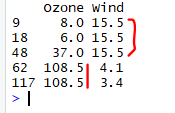
> mydata[c(9,18,48,62,117),c(1,3)]
# The observations of variables Ozone and Wind before Imputation of Outliers
> mydata[c(9,18,48,62,117),c(1,3)]
--------------------------------------------------------------------------------------------------------
Thanks, TAMATAM ; Business Intelligence & Analytics Professional
--------------------------------------------------------------------------------------------------------
Thanks, TAMATAM ; Business Intelligence & Analytics Professional
--------------------------------------------------------------------------------------------------------


No comments:
Post a Comment
Hi User, Thank You for visiting My Blog. If you wish, please share your genuine Feedback or comments only related to this Blog Posts. It is my humble request that, please do not post any Spam comments or Advertising kind of comments, which will be Ignored.