Friday, November 30, 2018

How to Visualize data with Histogram using ggplot2 Package in R

Visualize data with Histogram using the Functions of ggplot2 Package in R
The Histogram is used to visualize and study the frequency distribution of a univariate(one quantitative variable).The histogram is the foundation of univariate descriptive analytics.

It can be used to visualize the data that previously summarized in either a frequency, relative frequency, or percent frequency distribution.

A Histogram can be constructed by placing the variable of interest on x-axis, and the frequency on the y-axis. The frequency of each class(range of values divided into buckets on the x-axis) are shown by the vertical rectangular bars.
The width of the bars is determined by the class limits on the x-axis and the height of the bar is the corresponding frequency distribution.
In R, the histogram can be created using the hist() function  R base package "graphics". We can also make a histogram using qplot() and ggplot() functions of ggplot2, “a plotting system for R, based on the grammar of graphics”. This post will focus only on making a Histogram with ggplot2 Package.

Example :
We will use the R's airquality dataset (airquality {datasets}) , to visualize with Histogram using the functions of ggplot2 Package.
This dataset shows the Daily air quality measurements for the variables Temperature, Wind, Ozone, Solar in a City for the period from May to September.
In our example, we focus on (the study of interest) only the Temperature variable (airquality$ temp).

>install.packages("ggplot2")
>library(ggplot2) 
>install.packages("dplyr")
>library(dplyr)


Basic Study of the Data
First we will have a look at the 'airquality' data set. Please note that we are not performing any data wrangling here.
>airquality

> as_tibble(airquality)  # tibble::as_tibble similar to dplyr :tbl_df

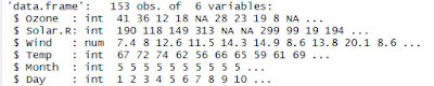
> str(airquality) # Structure of the dataset

> summary(airquality) #Summary statistics of the dataset

Now from the above dataset, we will consider only the Temp variable to visualize with Histogram, as it can study the frequency distribution of one quantitative variable.

Creating a Histogram for the variable Temp (airquality$temp) using qplot() function :
In ggplot2 package we have two options to make a Histogram, we can either use the qplot() function(similar to the graphics::hist() function) or ggplot() function. >qplot(airquality$Temp, geom="histogram") Or
>ggplot(data=airquality, aes(Temp)) + geom_histogram()

here, geom : The type of geomentry (the Shape)
aes : The aes() function do the Aesthetic mappings describe how variables in the data are mapped to visual properties (aesthetics) of geoms.
This function also standardizes aesthetic names by converting color to colour (also in the substrings, e.g. point_color to point_colour) and translating old style R names to ggplot names (eg. pch to shape, cex to size).

Output:
Notes:
The qplot() function is a simpler but less customizable wrapper around ggplot.
The ggplot() allows for maximum features and flexibility.

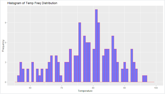
Enhancing the Histogram with use of more properties in qplot() function :
Now we will enhance the above Histogram by adding the following additional properties.. main - tiltle of the Visual,
binwidth - width between the bins in each class ( eg: 3 bins between the Class 70-80, as showing in the below Histogram)
xlab - label of x-axis,
ylab - label of y-axis,
fill -  the color filling for the bars(bins),
col - the color for the margin of the bars,
alpha - the transparency of the fill; the value of alpha is between 0 (fully transparent) and 1 (opaque).
xlim - the limits for the range of the distribution of x-axis values
ylim - the limits for the range of the distribution of y-axis values

>qplot(airquality$Temp,
           geom="histogram",
           binwidth = 0.75,
           main = "Histogram of Temp Freq Distribution",
           xlab = "Temperature",
           ylab = "Frequency",
           fill=I("blue"),
           col=I("red"),
           alpha=I(0.5),
           xlim=c(55,100)
)


Notes:
The I() function inhibits the interpretation of its arguments. In this case, the col argument is affected. Without it, the qplot() function would print a legend, saying that "col = 'red' ".
The qplot() function also allows you to set limits on the values that appear on the x-and y-axes. Just use xlim and ylim, in the same way as it was described for the hist() function.
If we don't specify the binwidth, xlim, ylim, then R will automatically decide based on the data distribution.

Output :

Creating a Histogram for the variable Temp (airquality$temp) using ggplot() function :
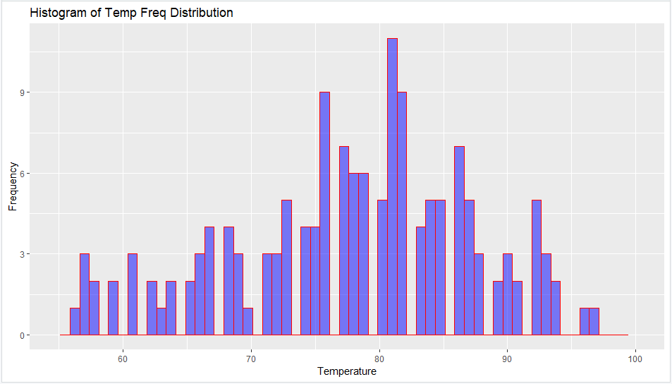
Now we will create a similar Histogram as above using ggplot () function as follows...
>ggplot(data=airquality, aes(Temp)) +
             geom_histogram(breaks=seq(55, 100, by = 0.75),
                                         col="blue",
                                         fill="yellow",
                                         alpha = 0.5
) +
                            labs(title="Histogram of Temp Freq Distribution") +
                            theme(plot.title = element_text(hjust = 0.5)) +
                            labs(x="Temperature", y="Frequency") +
                            xlim(c(55,100)) +
                            ylim(c(0,12))

Notes :
We can adjust the bin width with breaks.
labs() function is used specify the titles for main, x-axis and y-axis.
theme() function is used to align the main title to center.

Output:

Adding the Bin Count in the Histogram :
We can add the bin count to the histogram using the stat_bin() function, as defined below.
> ggplot(data=airquality, aes(x=Temp,y=..count..)) +
   geom_histogram(col="blue",
                               fill="yellow",
                               alpha = 0.5
) +
                  stat_bin(aes(label=..count..),geom="text", bins=30,vjust=-0.5) +
                  labs(title="Histogram of Temp Freq Distribution") +
                  theme(plot.title = element_text(hjust = 0.5)) +
                  labs(x="Temperature", y="Frequency") +

                  xlim(c(55,100))

Output :

Coloring the Bins based on the Frequency/Count :
We can also fill the bins with colors according to the frequency/count of numbers that are presented in the y-axis, something that is not possible in the qplot() function.
The default color scheme is blue (if you use only aes(fill=..count..)). If you wants to specify desired colors for the bins with low and high frequency values from the y-axis, we should add some additional properties to the code: 
the scale_fill_gradient, along with aes(fill=..count..).

For example, if we wants to add the yellow color for bins with low frequency values, red color for the bins with higher frequency values, we can do it using the following code...

>ggplot(data=airquality, aes(Temp)) +
             geom_histogram(breaks=seq(55, 100, by = 0.75),
                                         col="blue",
                                         alpha = 0.5) +
                                        
aes(fill=..count..) +
            scale_fill_gradient("Freq.legend", low = "yellow", high = "red") +
            labs(title="Histogram of Temp Freq Distribution") +
            theme(plot.title = element_text(hjust = 0.5))+
            labs(x="Temperature", y="Frequency") +
            xlim(c(55,100)) +
            ylim(c(0,12))


Output :


Adding the Trend line on Histogram with Density :We will use the aes(y=..density..) function inside the geom_histogram() function to add the Density values on y-axis, instead of the Frequency/Count.
Next we will add the geom_density(col="purple") function to add a trend line of purple color over bins.
>ggplot(data=airquality, aes(Temp)) +
  geom_histogram(aes(y =..density..),
                 breaks=seq(55, 100, by = 1.0),
                 col="blue",
                 fill="yellow",
                 alpha = 0.5) +
  geom_density(col="purple")+
  labs(title="Histogram of Temp Freq Distribution") +
  theme(plot.title = element_text(hjust = 0.5) ) +

  labs(x="Temperature", y="Density") +

  xlim(c(55,100))

Output :


Difference between Frequency and Density in a Histogram:
Now will see the difference between the Frequency(Count) and the Density in a Histogram using the below example.
Suppose we have the observations X1,X2,…,X100 is a random sample of size n from a normal distribution with mean μ=100 and standard deviation σ=12.
Also, we have bins (intervals) of equal width, which we use to make a histogram.

Frequency Histogram :
The vertical scale of a 'frequency histogram' shows the number of observations in each bin. Optionally, we can also put numerical labels top of each bar that show how many individuals it represents.
Density Histogram :
The vertical scale of a 'density histogram' shows units that make the total area of all the bars add to 1. This makes it possible to show the density curve of the population using the same vertical scale.
From above, we know that the tallest bar has 30 observations, so this bar accounts for the relative frequency (30/100)=0.3 of the observations. The width of this bar is 10, its density is 0.03 and its area is 0.03(10)=0.3.
The density curve(trend line) of the distribution Norm(100,15) is shown on the histogram. The area beneath this density curve is also 1.(By definition, the are beneath the density function is always 1.)

Optionally, we have added tick marks below the histogram to show the locations of the individual observations.
Notes:
If the frequency of the ith bar is fi, then its relative frequency is ri=(fi/n), where n is a sample size. Its density is di=(ri/wi), where wi is its width. Generally we should make the density histogram only if each bar has the same width.

--------------------------------------------------------------------------------------------------------
Thanks, TAMATAM ; Business Intelligence & Analytics Professional
--------------------------------------------------------------------------------------------------------

Thursday, November 29, 2018

What is the difference between rnorm(),runif() and sample() Functions in R

How to generate Random numbers using rnorm(), runif() and sample() Functions in R
rnorm () :
The rnorm() function is used to generate n normal random numbers with a specified mean and standard deviation.
The rnorm() function generates the random values from the normal distribution. Normally distributed random numbers on an interval have probabilities that follow the normal distribution bell curve, so numbers closer to the mean are more likely to be selected or to happen. 
Syntax :
rnorm(n, mean = , sd = )

Examples:
> set.seed(100)
>rnorm(10,mean=0,sd=1)
This will generate the 10 Random Numbers with Mean=0 and Standard Deviation=1.
[1] -0.9531302 1.1858818 -0.2572629 0.4372134 -0.3650827 0.4966740 0.5557346 0.6712590 -0.9485679 1.1848094
When we use set.seed(int) , we can get same random numbers again and again with same seed. Seed can be any unique integer.
> set.seed(100)
>rnorm(10,mean=0,sd=1)
[1] -0.9531302 1.1858818 -0.2572629 0.4372134 -0.3650827 0.4966740 0.5557346 0.6712590 -0.9485679 1.1848094


if you don't set the seed, the random number series will be new every time we run.
> rnorm(10,mean=0,sd=1)
 [1]  0.08988614  0.09627446 -0.20163395  0.73984050  0.12337950 -0.02931671 -0.38885425  0.51085626 -0.91381419  2.31029682
> set.seed(123) 
> rnorm(10,mean=5,sd=3) 
[1] 3.318573 4.309468 9.676125 5.211525 5.387863 10.145195 6.382749 1.204816 2.939441 3.663014
#Round down/up to nearest integer
> set.seed(123) 
> round(rnorm(10,mean=5,sd=3)) 
[1] 3 4 10 5 5 10 6 1 3 4 
#Round down to nearest integer
> set.seed(123)
> floor(rnorm(10,mean=5,sd=3)) 
[1] 3 4 9 5 5 10 6 1 2 3
#Round up to nearest integer
> set.seed(123) 
> ceiling(rnorm(10,mean=5,sd=3)) 
[1] 4 5 10 6 6 11 7 2 3 4

runif () :
The runif() function is used to generate n uniform random numbers lies in the interval (min, max).
The runif() function generates the random values from the uniform distribution.Uniformly distributed random numbers on an interval have equal probability of being selected or happening.
Syntax :
runif(n, min = , max = )

Examples :
>runif(10, min=5,max=25)
This will generate the 10 Random Numbers with between 5 and 25.
[1] 22.790786 18.856068 17.810136 24.885396 18.114116 19.170609 15.881320 16.882840 10.783195 7.942273
We can set the Seed for this function as well.
> set.seed(1) 
> runif(10, min=5,max=25) 
[1] 10.310173 12.442478 16.457067 23.164156 9.033639 22.967794 23.893505 18.215956 17.582281 6.235725
> set.seed(1) 
> runif(10, min=5,max=25) 
[1] 10.310173 12.442478 16.457067 23.164156 9.033639 22.967794 23.893505 18.215956 17.582281 6.235725

sample () :
The sample() function is used to generate a random sample of observations from the population. Make sure sample size should be smaller than population.

The sample() function is similar to runif(). The runif() gives fractional numbers and sample() gives whole numbers.
Syntax:
sample(population_size, sample_size, replace=FALSE)
here,the replace attribute is related to sampling techniques. When you sample replace = False, the element/number picked for sampling will not kept back in entire population to be picked again in same sample.
Examples :
> sample(x=10, size=9,replace=F) 
[1] 3 2 6 10 5 7 8 4 1
> sample(x=10, size=9,replace=T) 
[1] 8 10 3 7 2 3 4 1 4
> sample(x=c(0, 1), size=10, replace=TRUE) 
[1] 1 0 0 1 0 0 1 1 1 0 
> sample(x=c(0, 1), size=10, replace=FALSE) 
Error in sample.int(length(x), size, replace, prob) : cannot take a sample larger than the population when 'replace = FALSE'.
> sample(LETTERS, 5) 
[1] "S" "K" "T" "O" "R" 
> sample(letters, 5) 
[1] "o" "n" "s" "a" "k"
> set.seed(007) 
> sample(LETTERS, 5) 
[1] "Z" "J" "C" "B" "F" 
> set.seed(007) 
> sample(letters, 5) 
[1] "z" "j" "c" "b" "f"
> sample(month.name,5)
[1] "September" "August" "May" "November" "April"
> sample(month.abb,5) 
[1] "Mar" "Jan" "Nov" "Dec" "May"

Normal Vs. Uniform Distribution :
Image source : math.stackexchange.com

The green line shows a uniform distribution over the range [−5,5]. Informally, each number in the range is equally ("uniformly") likely to be picked. 
The red line shows a normal distribution with mean of 0 and standard deviation of 1. Numbers close to the mean are much more likely to be picked than those far away from the mean, in a particular and very special way.

--------------------------------------------------------------------------------------------------------
Thanks, TAMATAM ; Business Intelligence & Analytics Professional
--------------------------------------------------------------------------------------------------------

How to Join Datasets with dplyr() Package in R Programming

What are the dplyr () Package functions in R for Joining Datasets
Like SQL Joins, in R also we can perform various Joins on the Datasets as below using the dplyr () Package. Currently dplyr supports four types of mutating joins and two types of filtering joins.

Now we will discuss about all the Joins using the following data sets.
Left Dataset (dtCust)
Right Dataset ( dtSales) 
> library(dplyr)
I. Mutating Joins ::
Mutating joins combine variables from the two dataframes.
inner_join() :

The inner_join() function return all rows from x where there are matching values in y, and all columns from x and y. If there are multiple matches between x and y, all combination of the matches are returned.
Syntax :
inner_join(x, y, by = "KeyVariable", copy = FALSE, suffix = c(".x", ".y"), …)
Arguments() :
x, y : datasets to join.
by : a character vector of variables to join by. If NULL, the default, *_join() will do a natural join, using all variables with common names across the two tables.
To join by different variables on x and y use a named vector. For example, by = c("a" = "b") will match x.a to y.b.

copy : If x and y are not from the same data source, and copy is TRUE, then y will be copied into the same source as x

This allows you to join tables across sources, but it is a potentially expensive operation so you must opt into it.
suffix : If there are non-joined duplicate variables in x and y, these suffixes will be added to the output to disambiguate them. Should be a character vector of length 2.
… : other parameters passed onto methods, for instance, na_matches to control how NA values are matched.
Example :
Now we will do Inner Join the above two datasets using the inner_join() function as follows..
> inner_join(dtCust,dtSales,by="Cust_Id",copy=F,suffix=c("_L","_R"))
If the KeyVariable name is different in Right dataset then specify them as follows..
> inner_join(dtCust,dtSales,by=c("Cust_Id"="CustId),copy=F,suffix=c("_L","_R"))

Notes:
From the above output we noticed that , the "Cust_Segment" has been writer twice, one from Left Table and another from Right Table, which suffixed by specified character vectors _L , _R. If you don't wants to display suffix, simply you can specify as suffix=c("","")
Also we can write one "Cust_Segment" from both the tables by including it in Join Columns and ignore suffix argument as follows..
>inner_join(dtCust,dtSales,by=c("Cust_Id","Cust_Segment"),copy=F)

We can also select the specific columns from Right Table instead of all columns as follows..
>inner_join(dtCust,select(dtSales,Cust_Id,FiscalQuarter,Net_Sales),by="Cust_Id",copy=F)
Note: Please make sure add Join Column in the select ()


Now we can group by and summarize this joined data as follows..
>dtCust %>%
  inner_join(select(dtSales,Cust_Id,FiscalQuarter,Net_Sales),by="Cust_Id",copy=F) %>%
  group_by(Cust_Id,Cust_Name,Cust_Segment,FiscalQuarter) %>%

  summarize(Net_Sales=sum(Net_Sales))

left_join() :
The left_join() function return all rows from x, and all columns from x and y. Rows in x with no match in y will have NA values in the new columns. If there are multiple matches between x and y, all combinations of the matches are returned.
Syntax :
left_join(x, y, by = "KeyVariable", copy = FALSE, suffix = c(".x", ".y"), …)
Example :
Now we will do Left Join the above two datasets using the left_join() function as follows..
>left_join(dtCust,select(dtSales,Cust_Id,FiscalQuarter,Net_Sales),by="Cust_Id",copy=F)

NA's have been return for the records that have no match in the right.
right_join() :
The right_join() return all rows from y, and all columns from x and y. Rows in y with no match in x will have NA values in the new columns. If there are multiple matches between x and y, all combinations of the matches are returned.
Syntax :
right_join(x, y, by = "KeyVariable", copy = FALSE, suffix = c(".x", ".y"),...)
Example :
Now we will do Right Join the above two datasets using the right_join() function as follows..
>right_join(dtCust,select(dtSales,Cust_Id,FiscalQuarter,Net_Sales),by="Cust_Id",copy=F)

full_join() :
The full_join() function return all rows and all columns from both x and y. When there are not matching values, returns NA for the one missing.
Syntax:
full_join(x, y, by = "KeyVariable", copy = FALSE, suffix = c(".x", ".y"), …)
Example :
Now we will do Full Join the above two datasets using the full_join() function as follows..
>full_join(dtCust,select(dtSales,Cust_Id,FiscalQuarter,Net_Sales),by="Cust_Id",copy=F)

II.Filtering joins ::
Filtering joins keep the variables from the left dataframe, that having either the match or not having the match in Right dataframe.
semi_join() :
The semi_join() function returns all rows from x where there are matching values in y, and keeping just columns from x.
A semi join differs from an inner join because an inner join will return one row of x for each matching row of y, where a semi join will never duplicate rows of x.
Syntax:
semi_join(x, y, by = "KeyVariable", copy = FALSE, …)
Example :
Now we will do Semi Join the above two datasets using the semi_join() function as follows..
>semi_join(dtCust,dtSales,by="Cust_Id",copy=F)
anti_join() :
The anti_join() function returns all rows from x where there are no matching values in y, keeping just columns from x.
Syntax:
anti_join(x, y, by = "KeyVariable", copy = FALSE, …)

Example :
Now we will do Semi Join the above two datasets using the anti_join() function as follows..

>anti_join(dtCust,dtSales,by="Cust_Id",copy=F)

III. Set Operations :
The R "dplyr" package also provides the functions union(), union_all(), intersect(), setdiff(), setequal() to perform the set operations on the data sets.
Make sure both datasets should have the same structure(Variables should be same).
Example :
Suppose we have the two data sets as follows, on which we perform the set operations.

>dtSales1

>dtSales2
 Note : From the both the datasets, we observed that 2 observations are duplicated.

union_all () :
The union_all() function will combine both the data sets, does not bother about duplicates.
>union_all(dtSales1,dtSales2)

union() :
The union() function will combine both the data sets, and returns the unique observations.
>union(dtSales1,dtSales2)
intersect() :
The intersect() function will returns common unique observations from both the datasets.
>intersect(dtSales1,dtSales2)
setdiff() :
The setdiff() function will returns the unique observations from left dataset, which are not part of the right data set.
>setdiff(dtSales1,dtSales2)
>setdiff(dtSales2,dtSales1)
setequal() :
The setequal() function will test whether two datasets are equal or not, and return a Boolean value.
>setequal(dtSales1,dtSales2)
FALSE: Different number of rows

--------------------------------------------------------------------------------------------------------
Thanks, TAMATAM ; Business Intelligence & Analytics Professional
--------------------------------------------------------------------------------------------------------

Friday, November 23, 2018

How to Connect and Read data from SQL Server Databse in R

How to Connect to a RDBMS using ODBC Package in R
The "odbc" package (developed by Jim and other members of the RStudio team), and the "DBI" package (developed by Kirill Müller with support from the R Consortium) provides a modern database interface for R
To communicate with databases, a common protocol is ODBC. ODBC is an open, cross-platform standard for interfacing with databases, whatever the database software and variant of the SQL language it implements.

R has also the "RODBC" package created by Brian Ripley, but the new "odbc" package provides an updated alternative.The "odbc" package is an ODBC interface for R that provides native support for additional data types (including dates, timestamps, raw binary, and 64-bit integers) and parameterized queries. 

The "odbc" package provides a DBI-compliant interface to Open Database Connectivity (ODBC) drivers. This allows for an efficient, easy to setup connection to any database with ODBC drivers available, including SQL Server, Oracle, MySQL, PostgreSQL, SQLite and others. The implementation builds on the nanodbc C++ library.
Benchmarks show that "odbc" is somewhat faster than "RODBC": 
3.2 times faster for reads, and 1.9 times faster for writes.

Connection Settings Syntax :
The following is the basic syntax of a connection to a odbc () supported RDBMS.>dbCon <- DBI::dbConnect(odbc::odbc(),
                  Driver = "[Driver Name]",
                  Server = "[Server Name]",
                  Database = "[Databse Name]",
                  UID = rstudioapi::askForPassword("Database User Name"),
                  PWD = rstudioapi::askForPassword("Database Password"),
   
              Port = 1433)

Here, we use the rstudioapi::askForPassword to enter values for UID, PWD during run time, instead of hardcoding the values.
Now we discuss about Connecting to SQL Server Database, Reading and Writing the Data from R.

Installing Required Packages :
odbc - This package provides the interface between the database driver and R.
DBI - This package provides the standardized functions related to database operations.

dbplyr - This package enables "dplyr" to interact with databases. It also contains the vendor-specific SQL translations.

>install.packages("odbc")
>install.packages("DBI")
>install.packages("dbplyr")
>install.packages("dplyr")


>library(odbc)
>library(DBI)
>library(dbplyr)
>library(dplyr)


Connecting to the SQL Server Database :
We will use the dbConnect() function from the "DBI" package to connect to the database.
>dbCon <- dbConnect(odbc::odbc(),
                                     Driver = "SQL Server",
                                     Server = "TAMATAM-PC",
                                     Database = "AnalyticsDB",
                                     Trusted_Connection=TRUE,
                                     UID = "TAMATAM-PC\\T P Reddy",
                                     PWD = "",
                                     Port = 1433
                                    )
Once we create a connection to the Database, you see the connection details in R Studio, with the list of Databases that you have access to.
 

#Disconnecting Server connection :
In R studio, we can disconnect from Connection section of the Environment Window as shown below.
Also we can disconnect using the below function.
> dbDisconnect(conn = con)

#Re-connecting to Server again:
We can reconnect to Server from the Connections Window in R Studio, by simply copying the below R Script and Run.
Or, You can connect by choosing the option from "Connect>R Console", then R will write the Connection string to the R Console, executes and establish the Connection again.
> library(odbc)
> dbCon <- dbConnect(odbc::odbc(), Driver = "SQL Server", Server = "TAMATAM-PC",
Database = "AnalyticsDB", Trusted_Connection = TRUE, UID = "TAMATAM-PC\\T P Reddy", PWD = "", Port = 1433)


Reading the Data from SQL Server Database :
Now can Read from SQL Server Database tables into R using various functions discussed below.
#List all the Tables in the SQL Server Connection (Includes all DBs Tables)
The dbListTables () function of "DBI" Package will list all the user, system tables from all the available Databases in the Connection "dbCon" , created in the above.
>library(DBI)
> dbListTables(dbCon)
> dbListTables(conn = dbCon )


#List all the user Tables from the specific Database(say AnalyticsDB) in SQL Server
> userTables <- dbGetQuery(dbCon, "Select * From [AnalyticsDB].Information_Schema.Tables Where Table_Type = 'BASE TABLE'")
>userTables

> userTables <- dbGetQuery(dbCon, "Select * From  [AnalyticsDB].Sys.objects 
Where Type = 'U' ")
>userTables

The dbGetQuery() will submit a query and fetch the results.We can also submit the query and fetch separately with dbSendQuery() and dbFetch().

The dbSendQuery() method only submits and synchronously executes the SQL query to the database engine. It does not extract any records, for that you need to use the dbFetch() method, and then you must call dbClearResult() when you finish fetching the records you need. For interactive use, you should almost always prefer dbGetQuery().
> userTables <- dbSendQuery(dbCon, "Select * From  [AnalyticsDB].Information_Schema.Tables Where Table_Type = 'BASE TABLE' ")

> myTables<-dbFetch(userTables)
>myTables

>dbClearResult(userTables)
Notes :
We should use dbSendQuery() and dbFetch() one after another. The n= argument in the function dbFetch() can be used to fetch only the part of a query result.
> dbFetch(userTables,n=10)
Then next n rows can fetched using dbFetch(userTables).
If we again run the above functions, we will get the warning massages as follows.
> userTables <- dbSendQuery(dbCon, "Select * From [AnalyticsDB].Information_Schema.Tables Where Table_Type = 'BASE TABLE' ")

Warning message:
In new_result(connection@ptr, statement) : Cancelling previous query

> dbFetch(userTables)
[1] TABLE_CATALOG TABLE_SCHEMA TABLE_NAME TABLE_TYPE
<0 rows> (or 0-length row.names).


>dbClearResult(userTables)

# List Tables starts with "Dim%" from the [AnalyticsDB]
> dbListTables(dbCon, table_name = "Dim%")
[1] "DimCustomers" "DimProducts" "DimRegion" "DimSuppliers"

# List the Filed Names of the Table "DimCustomers" from the [AnalyticsDB]
> dbListFields(dbCon, "DimCustomers")
[1] "Cust_Id" "Cust_Name" "Cust_Segment"


#Read full table into R as a Dataframe
>library(DBI)> dfCust<-dbReadTable(dbCon, "DimCustomers")

> dfCust

We can read a Table using the function tbl() of "dplyr" package
>library(dplyr)
> dfCust<-tbl(dbCon, "DimCustomers")> dfCust

#Counting the Rows of Table using the function tally() of "dplyr" package
> tally(tbl(dbCon, "DimCustomers"))


> x<-tally(tbl(dbCon, "DimCustomers"))
> show_query(x)
<SQL> SELECT COUNT(*) AS "n" FROM "DimCustomers"

Reading Data from a Join Query Result into R :
>library(DBI)
>JoinData <- dbGetQuery(dbCon,
"SELECT [SalesOrder_Id]
     ,[Order_Date]
     , D.[FiscalQuarter]
      ,R.[Region_Name]
      ,R.[Country]
      ,C.[Cust_Segment]
      ,C.[Cust_Name]
      ,P.[Prod_Name]
      ,[Net_Sales]
  FROM [dbo].[FactSales] S
     INNER JOIN
  [dbo].[Tbl_Calendar] D  ON S.[Order_Date]=D.[Date_Id]
     INNER JOIN
  [dbo].[DimRegion] R  ON S.[SalesRegion_Id]=R.[Region_Id]
     INNER JOIN
  [dbo].[DimProducts] P  ON S.[Prod_Id]=P.[Prod_Id]
     INNER JOIN
  [dbo].[DimCustomers] C  ON S.[Cust_Id]=C.[Cust_Id] "
)

>JoinData


Writing Dataframe to SQL Server as Table :
Now we will write the above Dataframe "JoinData" to the SQL Server as a Table with the same Name.
>library(DBI)
>dbWriteTable(dbCon, "JoinData", JoinData,overwrite=TRUE,append=FALSE)

Output:
Now we will see the table as JoinData in the SQL Server database [AnalyticsDB]


#--------------------------------------------------------------Thanks--------------------------------------------------------------#

Featured Post from this Blog

How to compare Current Snapshot Data with Previous Snapshot in Power BI

How to Dynamically compare two Snapshots Data in Power BI Scenario: Suppose, we have a sample Sales data, which is stored with Monthly Snaps...

Popular Posts from this Blog