Visualize data with Box and Whisker Plot using the Functions of ggplot2 Package in R
The box plot (whisker plot) is a standardized way of visualizing the distribution of data based on the statistical five number summary of the dataset.
Minimum
First Quartile(Q1)
Median (Q2,Second Quartile)
Third Quartile(Q3)
Phase - I :: First we will discuss about some related statistical concepts and fiver number statistics..
Q1=First Quartile, or 25th percentile.
Q2 value is lies at index i=(50/100)*n


Example :
We will use the R's airquality dataset (airquality {datasets}) , to visualize with Histogram using the functions of ggplot2 Package.
This dataset shows the Daily air quality measurements for the variables Temperature, Wind, Ozone, Solar in a City for the period from May to September.
>install.packages("dplyr")
>library(dplyr)
Basic Study of the Data :
 > as_tibble(airquality) # tibble::as_tibble similar to dplyr :tbl_df
 Converting Month variable to Factor, in order to use it as a Grouping Variable.
>airquality$Month <- factor(airquality$Month,labels = c("May", "Jun", "Jul", "Aug", "Sep"))
> str(airquality) # Structure of the dataset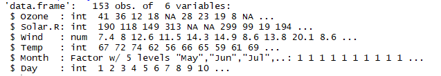

 Applying the custom 'Economist’ theme, modifying:
There are a wider range of pre-built themes available as part of the ggthemes package. Below we’ve applied theme_economist() to the above boxplot.
Applying the custom 'Economist’ theme, modifying:
There are a wider range of pre-built themes available as part of the ggthemes package. Below we’ve applied theme_economist() to the above boxplot.
Also, we have modified the box shape using notch=TRUE. The x-axis, y-axis lines colors are modified using axis.line.x, axis.line.y arguments, the x-axis, y-axis titles are modified using the axis.title argument inside the theme() function.
The x-axis, y-axis text elements can be modified using the axis.text.x, axis.text.y arguments
inside the theme() function.
install.packages("ggthemes")

The box plot (whisker plot) is a standardized way of visualizing the distribution of data based on the statistical five number summary of the dataset.
Minimum
First Quartile(Q1)
Median (Q2,Second Quartile)
Third Quartile(Q3)
Maximum
A box and whisker plot is a way of summarizing a set of data measured on an interval scale. It is often used in explanatory data analysis. This type of graph is used to show the shape of the distribution, its central value, and its variability.
A box and whisker plot is a way of summarizing a set of data measured on an interval scale. It is often used in explanatory data analysis. This type of graph is used to show the shape of the distribution, its central value, and its variability.
The box plot is useful for visualize and to know whether a distribution is skewed and there are any potential unusual observations (outliers) in the data set.
Phase - I :: First we will discuss about some related statistical concepts and fiver number statistics..
Percentile :
The Percentile provides the information about how the data are spread over the interval from the smallest value to the largest value.
For the data that do not contain numerous repeated values, the pth percentile divides the data into two parts.
The pth percentile (Eg: 50th percentile) is a value such that at least p percent (eg: 50%) of observations are less than or equal to this value and at least (100-p) observations are greater than or equal.
Calculating the pth Percentile :
We can calculate the pth percentile from a distribution of data by the following way..
First sort the data in an ascending order(Min to Max value)
Next compute the index I (the position of the pth percentile observation in the data) using the below formula.
i=(p/100)*n
where, p is the percentile of interest(eg:50th percentile) , n is the no.of obs in the sample.
Notes:
If i is not an integer, then we will round up , the next integer greater than the i denotes the position of the pth percentile.
If i is an integer, then pth percentile is the average of the values in the positions i and (i+1).
Example:
Suppose we have the data as follows which is ascending order.
3710,3755,3850,3880,3880,3890,3920,3940,3950,4050,4130,4325
From these observations, Now we will calculate the 60th percentile as follows...
First we need to calculate the index position i of the 60th percentile
i=(p/100)*n
i=(60/100)*12 = 7.2
Since i is not an integer, we have to round up, so that the index of 60th percentile is the next integer greater than 7.2 is the 8th position.
We can conclude that the 60th percentile is the observation/value lies at the 8th Position, that is equal to 3940.
Similarly we can calculate the 50th percentile (Median or Second Quartile or Q2), from the above data as follows...
i=(50/100)*12=6
Since i is an integer, the index of 50th percentile is the average of the values of the 6th and 7th positions.
We can conclude that the 50th percentile is equal to (3890+3920)/2=3905.
Quartiles :
It is often desirable to divide the data into four parts, with each part containing approximately one-fourth or 25% of observations. The division points/parts are referred as the quartiles.Q1=First Quartile, or 25th percentile.
Q2=Second Quartile((Median), or 50th percentile.
Q3=Third Quartile, or 75th percentile.
As discussed above, we can calculate the Q1, Q2, Q3 values as follows.
Q1 value is lies at index i=(25/100)*nQ2 value is lies at index i=(50/100)*n
Q3 value is lies at index i=(75/100)*n
Inter Quartile Range :
Inter Quartile Range(IQR) is a measure of variability that overcomes the dependency on extreme values.
IQR is the difference of Q3 and Q1, denotes the range of middle 50% data.
IQR =Q3-Q1
Outliers :
Sometimes a data set will have one or more observations with unusually large or unusually small values. These extreme values are called Outliers.
For a Normal Distribution(Bell shaped curve) of data, the observations are mostly falls with in the z-scores of -3 and +3 (standard deviations from the Mean).
The Outliers fall above the Upper Limit and fall below the Lower Limit of the observations.
We can also detect the Outliers based on the values of the Q1, Q3 and IQR.
Lower Limit = Q1-1.5(IQR)
Upper Limit = Q3+1.5(IQR)
Example:
In the simplest box plot the central rectangle spans the first quartile to the third quartile (the interquartile range or IQR). A segment inside rectangle shows Median, the lines connected from Third Quartile to Maximum, and First Quartile to Minimum are called "whiskers".

Outliers are either 3×IQR or more above the third quartile or 3×IQR or more below the first quartile.
Suspected outliers are slightly more central versions of outliers: either 1.5×IQR or more above the third quartile or 1.5×IQR or more below the first quartile.
If either type of outlier is present the whisker on the appropriate side is taken to 1.5×IQR from the quartile (the "inner fence") rather than the Max or Min.
The individual outlying data points are displayed as unfilled circles (for suspected outliers) or filled circles (for outliers). (The "outer fence" is 3×IQR from the quartile.)

---------------------------------------------------------------------------------------------------------
Phase-II :: Now we will discuss about creating the Box/Whisker Plot using R
In R, the histogram can be created using the boxplot() function of R package "graphics". We can also make a histogram using the ggplot() with geom_boxplot() function of the ggplot2, “a plotting system for R, based on the grammar of graphics”. This post will focus only on making a Histogram with ggplot2 Package.Example :
We will use the R's airquality dataset (airquality {datasets}) , to visualize with Histogram using the functions of ggplot2 Package.
This dataset shows the Daily air quality measurements for the variables Temperature, Wind, Ozone, Solar in a City for the period from May to September.
In our example, we focus on (the study of interest) only the Temperature variable (airquality$ temp).
>install.packages("ggplot2")
>library(ggplot2)>install.packages("ggplot2")
>install.packages("dplyr")
>library(dplyr)
Basic Study of the Data :
First we will have a look at the 'airquality' data set. Please note that we are not performing any data wrangling here.
>airquality
>airquality


>airquality$Month <- factor(airquality$Month,labels = c("May", "Jun", "Jul", "Aug", "Sep"))
> str(airquality) # Structure of the dataset

> summary(airquality) #Summary statistics of the dataset

Creating a Box and Whisker Plot ::
Now from the above dataset, we will consider the Temp (Continuous variable) and Month (Discreate Categorical variable used to group the data) variables visualize data with a box plot.
>ggplot(airquality, aes(x = Month, y = Temp)) +
geom_boxplot() +
scale_x_discrete(name = "Month") +
scale_y_continuous(name = "Temparature\n by Month")
geom_boxplot() +
scale_x_discrete(name = "Month") +
scale_y_continuous(name = "Temparature\n by Month")
Notes:
We can add the labels to the x-axis using "scale_x_discrete()" function, and to the y-axis by using the "scale_y_continuous()"
Output :

Adjusting the y-axis scale:
In above box plot, R automatically decides scale of the y-axis, based on the Min and Max values of all groups.
We can also adjust the scale of the y-axis, by specifying desired breaks using the function
We can also add the title for the plot using ggtitle() function and theme() function to align title in center.
>ggplot(airquality, aes(x = Month, y = Temp)) +
geom_boxplot() +
scale_x_discrete(name = "Month") +
scale_y_continuous(name = "Temparature\n by Month",
breaks = seq(0, 100, 5),
limits=c(50, 100)) +
geom_boxplot() +
scale_x_discrete(name = "Month") +
scale_y_continuous(name = "Temparature\n by Month",
breaks = seq(0, 100, 5),
limits=c(50, 100)) +
ggtitle("Boxplot of Mean Temp by Month") +

theme(plot.title = element_text(hjust = 0.5))
Output:

Adding color to the box, whiskers and outliers :
We can add the colors to the box, whiskers and outliers of the plot by adding the arguments or properties to the geom_boxplot () function.
>ggplot(airquality, aes(x = Month, y = Temp)) +
geom_boxplot(fill = "yellow", colour = "purple", alpha=0.75,
outlier.colour="red",outlier.shape =10 ) +
scale_x_discrete(name = "Month") +
scale_y_continuous(name = "Temparature\n by Month",
breaks = seq(0, 100, 5),limits=c(50, 100))+
theme(plot.title = element_text(hjust = 0.5))
geom_boxplot(fill = "yellow", colour = "purple", alpha=0.75,
outlier.colour="red",outlier.shape =10 ) +
scale_x_discrete(name = "Month") +
scale_y_continuous(name = "Temparature\n by Month",
breaks = seq(0, 100, 5),limits=c(50, 100))+
ggtitle("Boxplot of Mean Temp by Month")+
theme_bw() +theme(plot.title = element_text(hjust = 0.5))
Notes :
fill : adds the specified color to the box plot.
colour : adds the specified color to the whiskers.
outlier.color : adds the specified color to the outliers.
outlier.shape : modifies the outlier shape
alpha : adjusts the color transparency, values must be 0 to 1.
theme_bw () : this function adds the white background theme to the boxplot.
alpha : adjusts the color transparency, values must be 0 to 1.
theme_bw () : this function adds the white background theme to the boxplot.
Output :

Also, we have modified the box shape using notch=TRUE. The x-axis, y-axis lines colors are modified using axis.line.x, axis.line.y arguments, the x-axis, y-axis titles are modified using the axis.title argument inside the theme() function.
The x-axis, y-axis text elements can be modified using the axis.text.x, axis.text.y arguments
inside the theme() function.
install.packages("ggthemes")
library(ggthemes)
>ggplot(airquality, aes(x = Month, y = Temp)) +
geom_boxplot(fill = "yellow", colour = "purple", alpha=0.75,
outlier.colour="red",outlier.shape =10,
size=1,notch=TRUE) +
scale_x_discrete(name = "Month") +
scale_y_continuous(name = "Temparature\n by Month",
breaks = seq(0, 100, 5),
limits=c(50, 100))+
ggtitle("Boxplot of Mean Temp by Month")+
theme_economist() +
theme(plot.title = element_text(family = "Arial", face = "bold", hjust = 0.5),
axis.line.x = element_line(size = 1, colour = "blue"),
axis.line.y = element_line(size = 1, colour = "pink"),
axis.title = element_text(family="Arial",size = 10,face="bold"),
axis.text.x=element_text(family = "Arial", face = "bold",size = 9),
axis.text.y=element_text(family = "Arial", face = "bold",size = 9)
)
Output :geom_boxplot(fill = "yellow", colour = "purple", alpha=0.75,
outlier.colour="red",outlier.shape =10,
size=1,notch=TRUE) +
scale_x_discrete(name = "Month") +
scale_y_continuous(name = "Temparature\n by Month",
breaks = seq(0, 100, 5),
limits=c(50, 100))+
ggtitle("Boxplot of Mean Temp by Month")+
theme_economist() +
theme(plot.title = element_text(family = "Arial", face = "bold", hjust = 0.5),
axis.line.x = element_line(size = 1, colour = "blue"),
axis.line.y = element_line(size = 1, colour = "pink"),
axis.title = element_text(family="Arial",size = 10,face="bold"),
axis.text.x=element_text(family = "Arial", face = "bold",size = 9),
axis.text.y=element_text(family = "Arial", face = "bold",size = 9)
)

--------------------------------------------------------------------------------------------------------
Thanks, TAMATAM ; Business Intelligence & Analytics Professional
--------------------------------------------------------------------------------------------------------
Thanks, TAMATAM ; Business Intelligence & Analytics Professional
--------------------------------------------------------------------------------------------------------


No comments:
Post a Comment
Hi User, Thank You for visiting My Blog. If you wish, please share your genuine Feedback or comments only related to this Blog Posts. It is my humble request that, please do not post any Spam comments or Advertising kind of comments, which will be Ignored.